So, what's your design process?
A common question I get asked during interviews for graphic design roles is,
"what is your process? How do you begin working on creative briefs?"
"what is your process? How do you begin working on creative briefs?"
I hope this is an excellent opportunity to explain how I get to
the solutions I make for my stakeholders.
the solutions I make for my stakeholders.
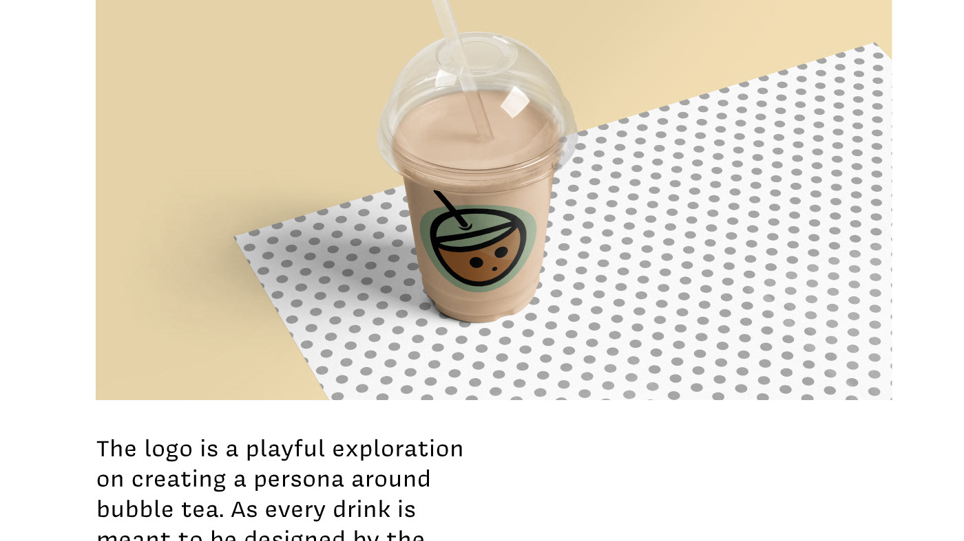
In this case study, I'm presenting my process of designing for a pop-up shop, Pound 4 Pound Burgers, an Oakland-based burger shop that partners up with breweries and boxing gyms.
The design challenge was creating a distinctly designed logo for Pound4Pound that revolved around Boxing and Food. After five rounds of cardio, who wouldn't want a beefy pick-me-up to get right back into the ring? Cause I sure would.
Pound4Pound already had distinct features in their original style, with frames shaped like championship belts, stars decorating each text box's ins and outs, and a boxing ring that supported their logo.
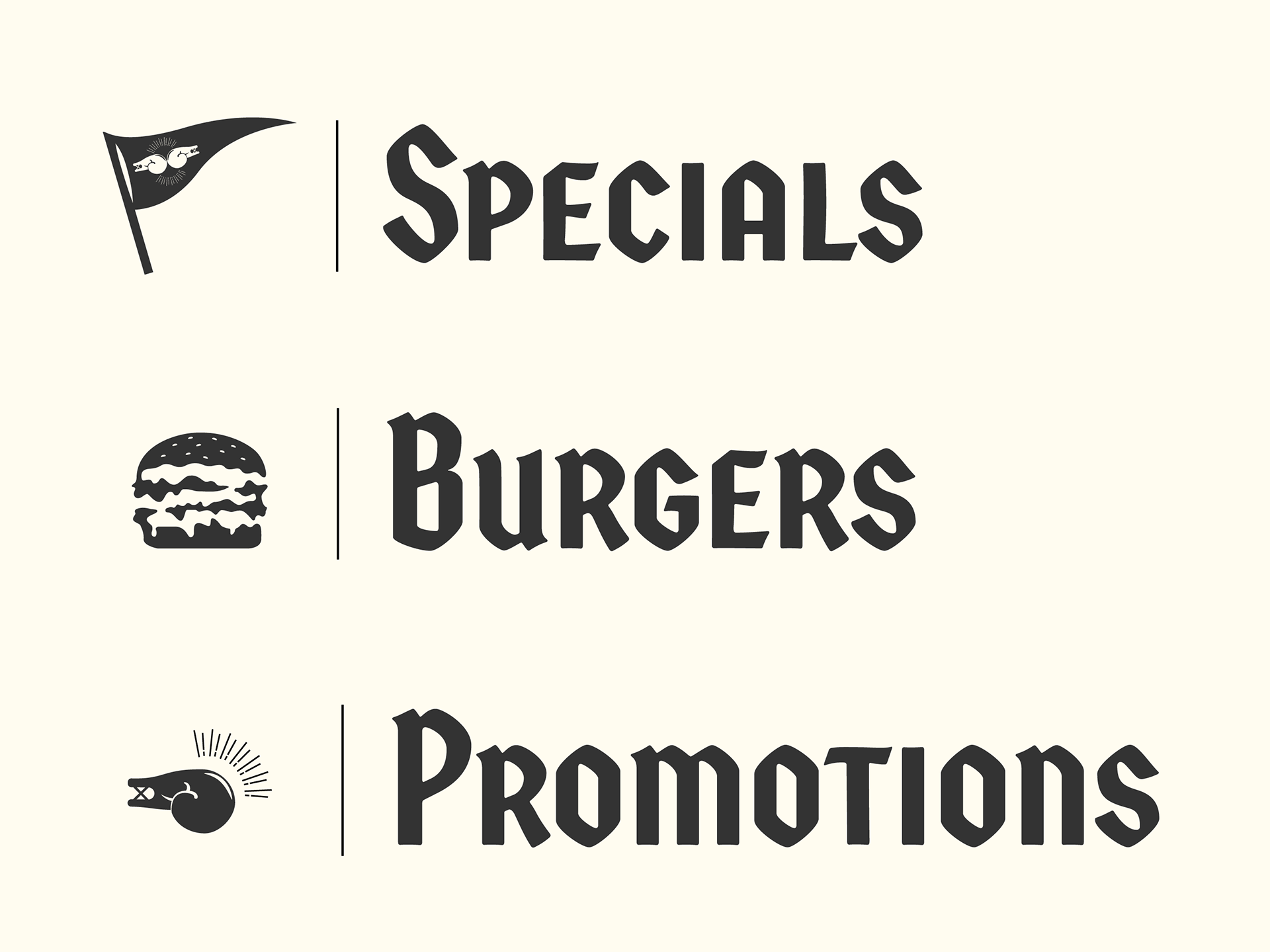
I aimed to take one of the features of the present logo and create a logo and complimentary design system around it to be used in all sorts of collateral.
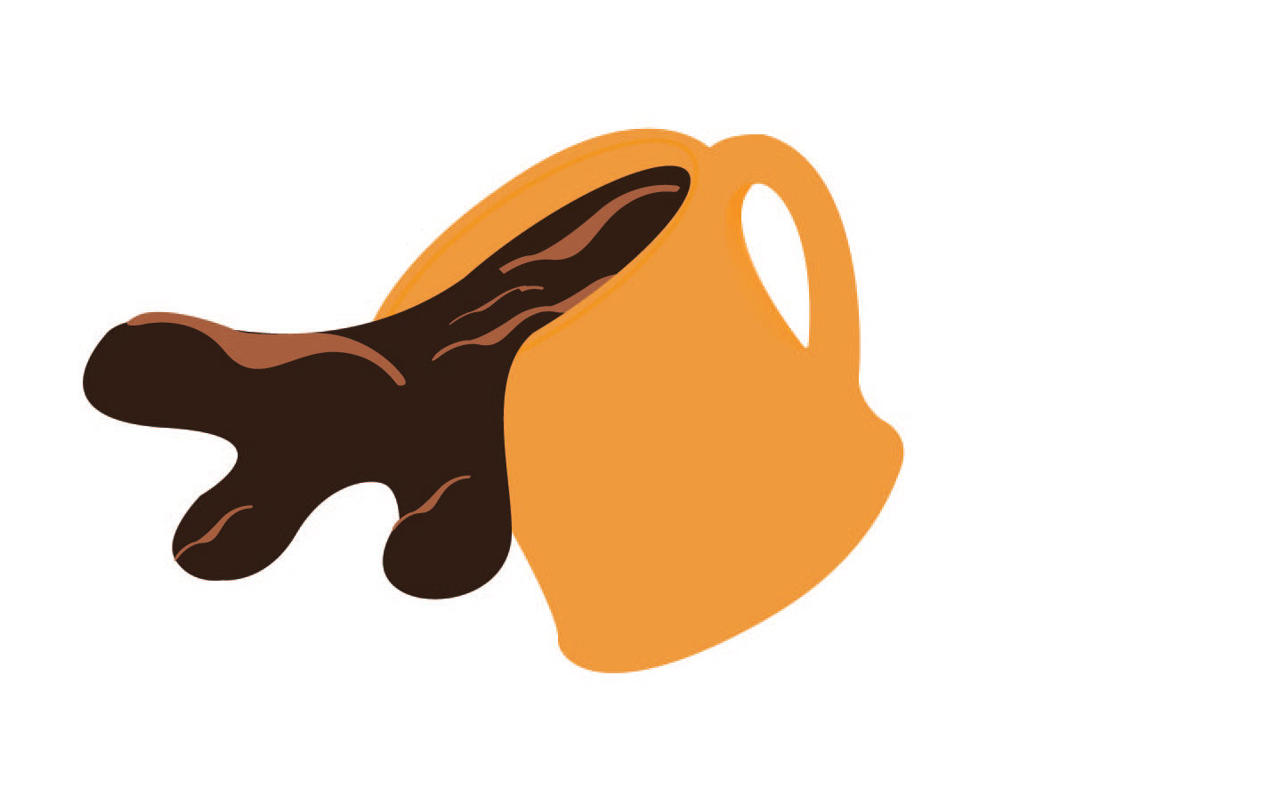
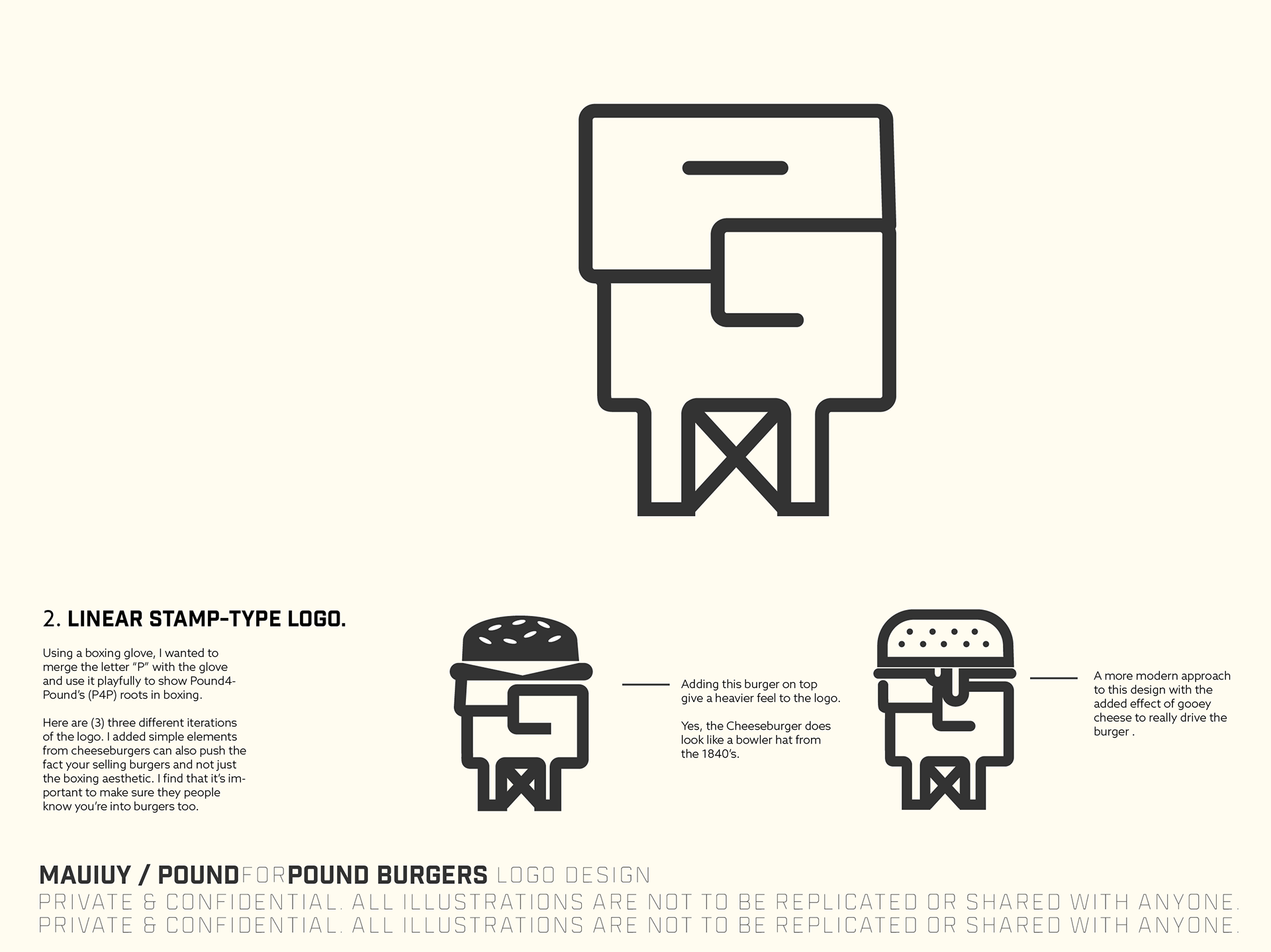
In my sketches, I initially designed my ideas around stars and a championship belt, and eventually, I just went with the good ol' boxing glove
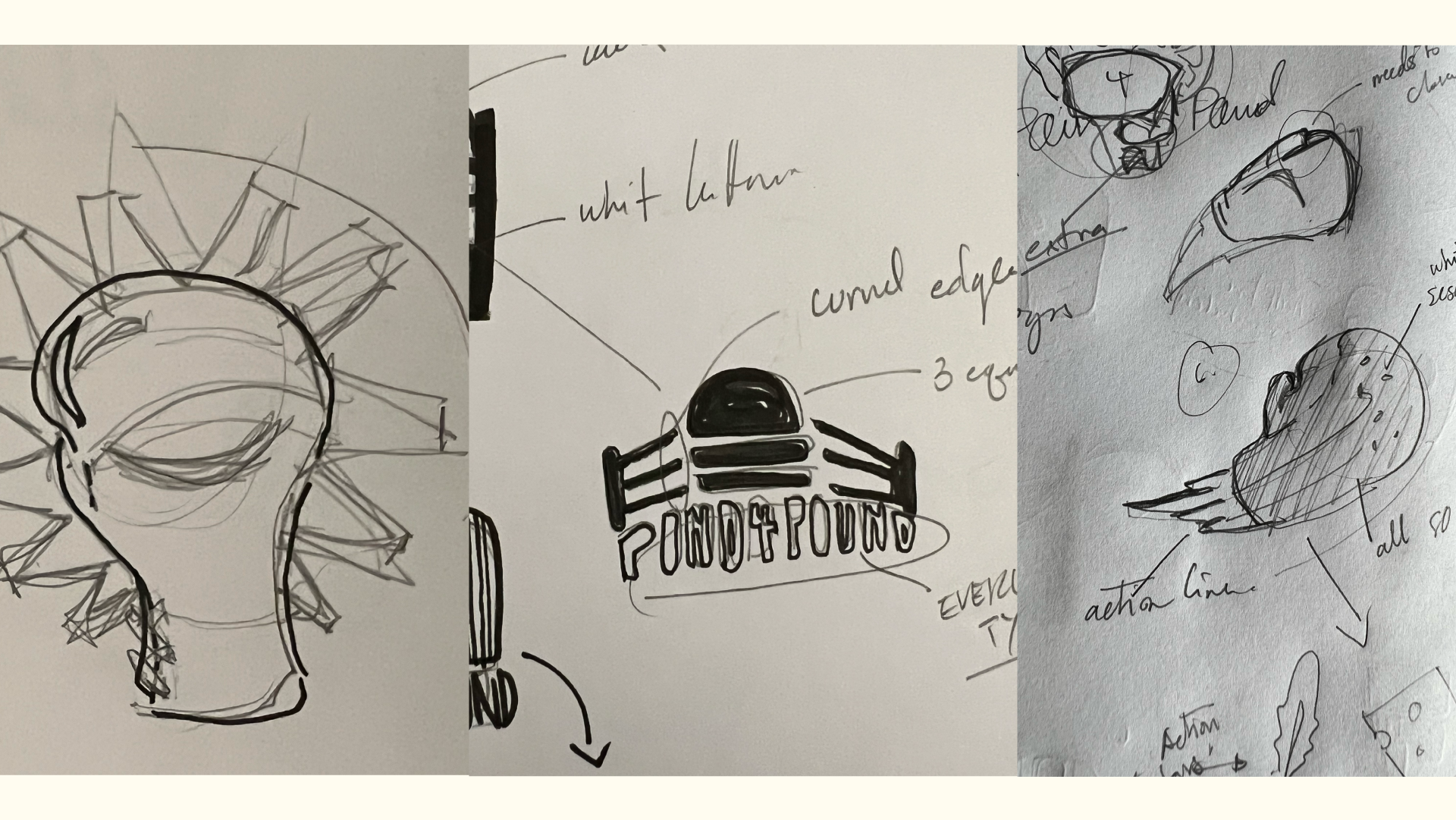
I wanted to do something with some action to the logo, which also tied back to eating or having a burger. It was easy to get lost in the "sauce" of designing boxing gloves that fit the motif, but then I'd lose the fact that it was a burger spot and not a boxing gym.
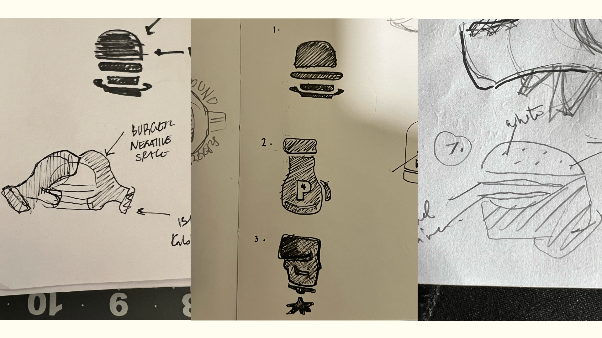
Then I decided to return to the basics and try to pull everything back to what I'm trying to design for — a Burger shop.
*ding**ding**ding* Round 1
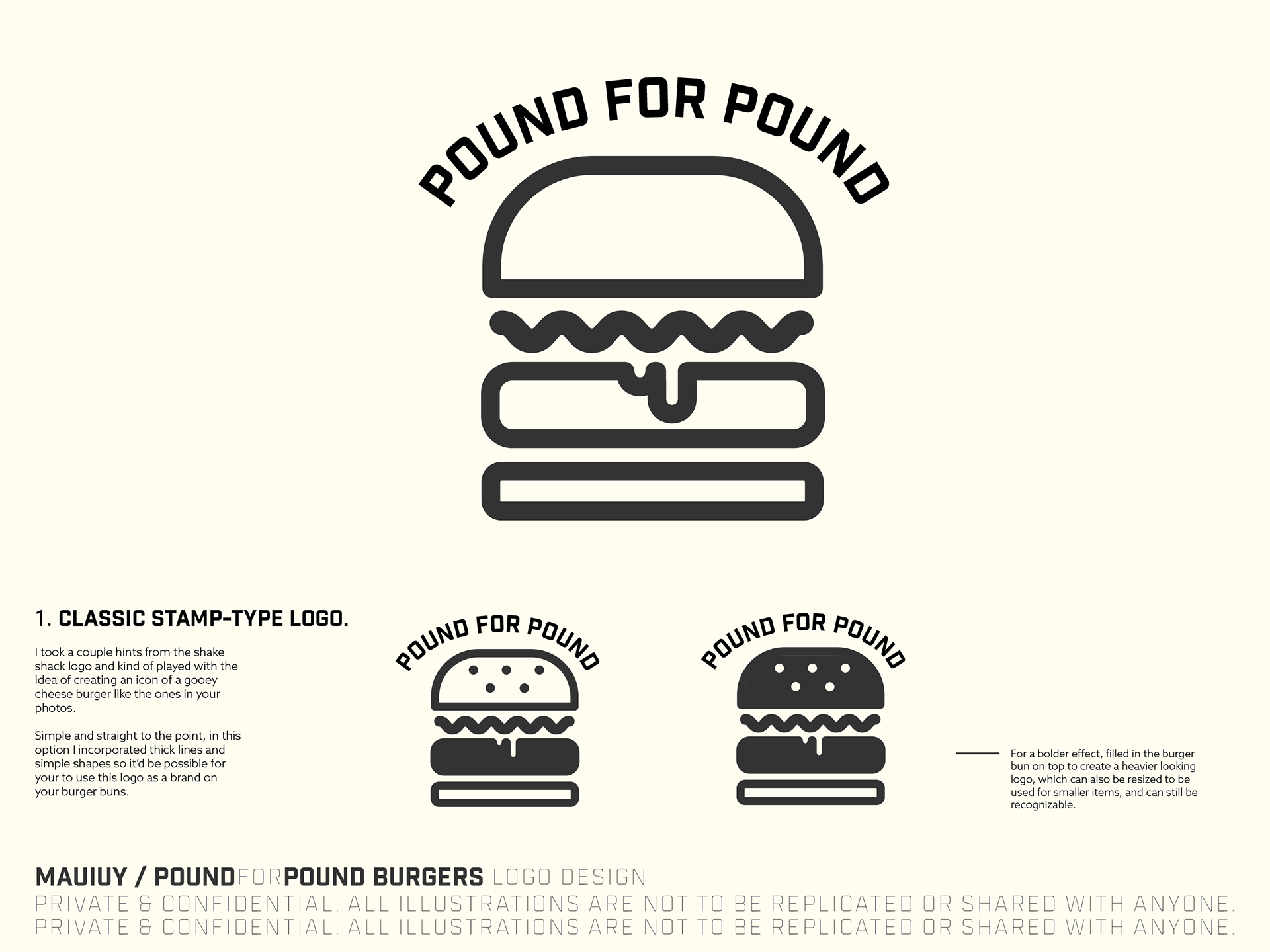
So in round 1, these were the initial ideas that I presented to Pound4Pound to get the ball rolling. Iterations and ideas started flooding my brain as soon as we finished our video call reviewing these logos.
These initial ideas weren't JUST to get the ball rolling but to get a better feel of what Pound4Pound was looking for in their next logo. When it comes down to creating logos for people, it's not that I want to get my designs through the door; I believe it's better to put something out there with mistakes and rough edges and learn what stakeholders dislike.
I like to hear what my stakeholders say and see the expressions on my client's faces when we talk about logos I've presented. I believe when clients critique the work given, it's not all about what someone is saying about the design at hand but how the critique is explained and expressed in the context of the situation.
"When words fail, action speaks. When action fails, eyes speak. When eyes fail, tears speak & when everything else fails, silence speaks."
- Idil Ahmed, Author
- Idil Ahmed, Author
I believe aesthetics follow function; when something works, then we can begin to create better iterations of that functionality. Take, for example, the cellphone or the mobile phone - the first versions presented to society were pagers and satellite phones. One was so small it could only take a couple of characters at a time. The other was a hulking piece of technology with an antenna that could pierce heaven. They were masterpieces in their own right; however odd, they got the job done and allowed people to stay connected — but the world of telecommunication didn't stop there, nor should we.
*ding**ding**ding* Round 2
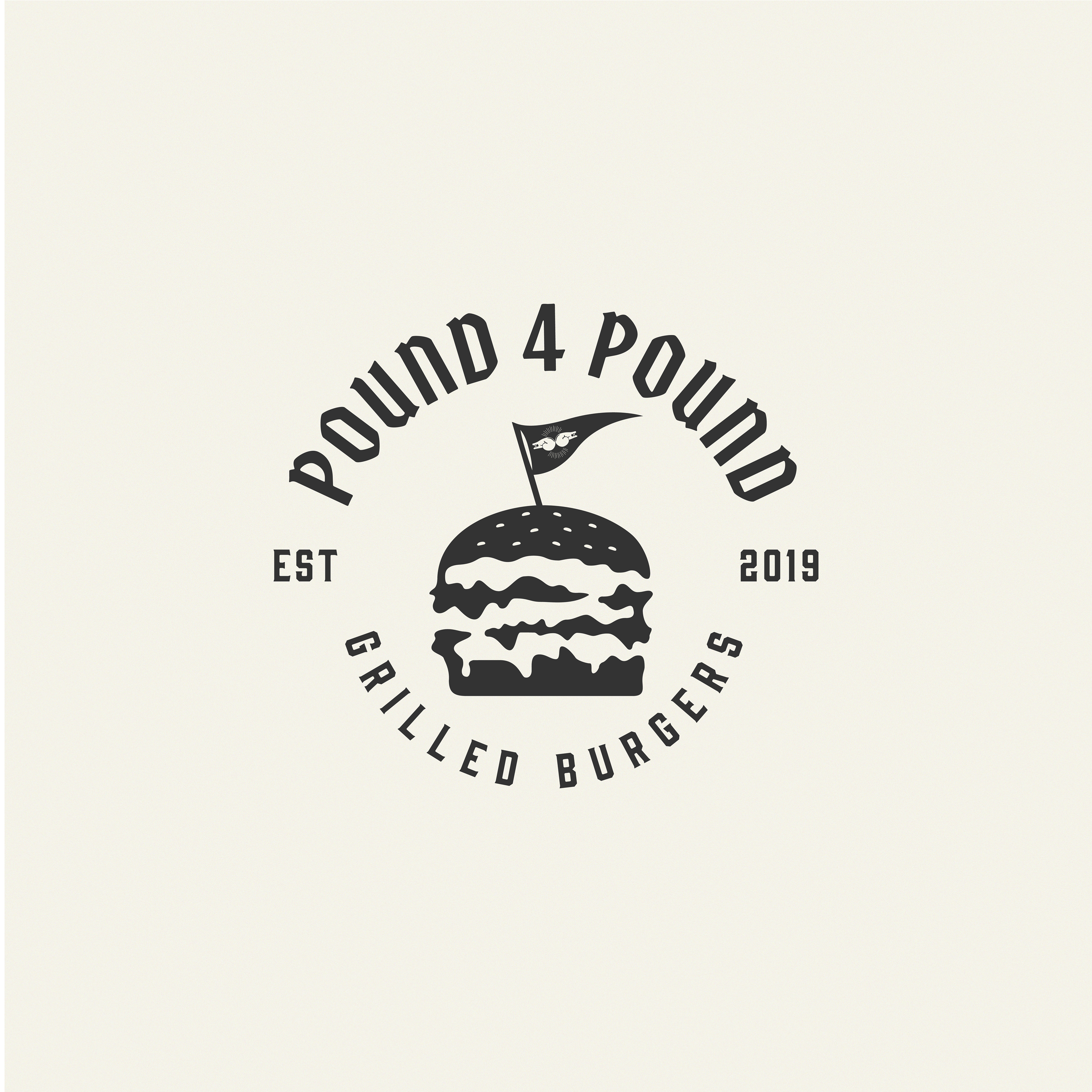
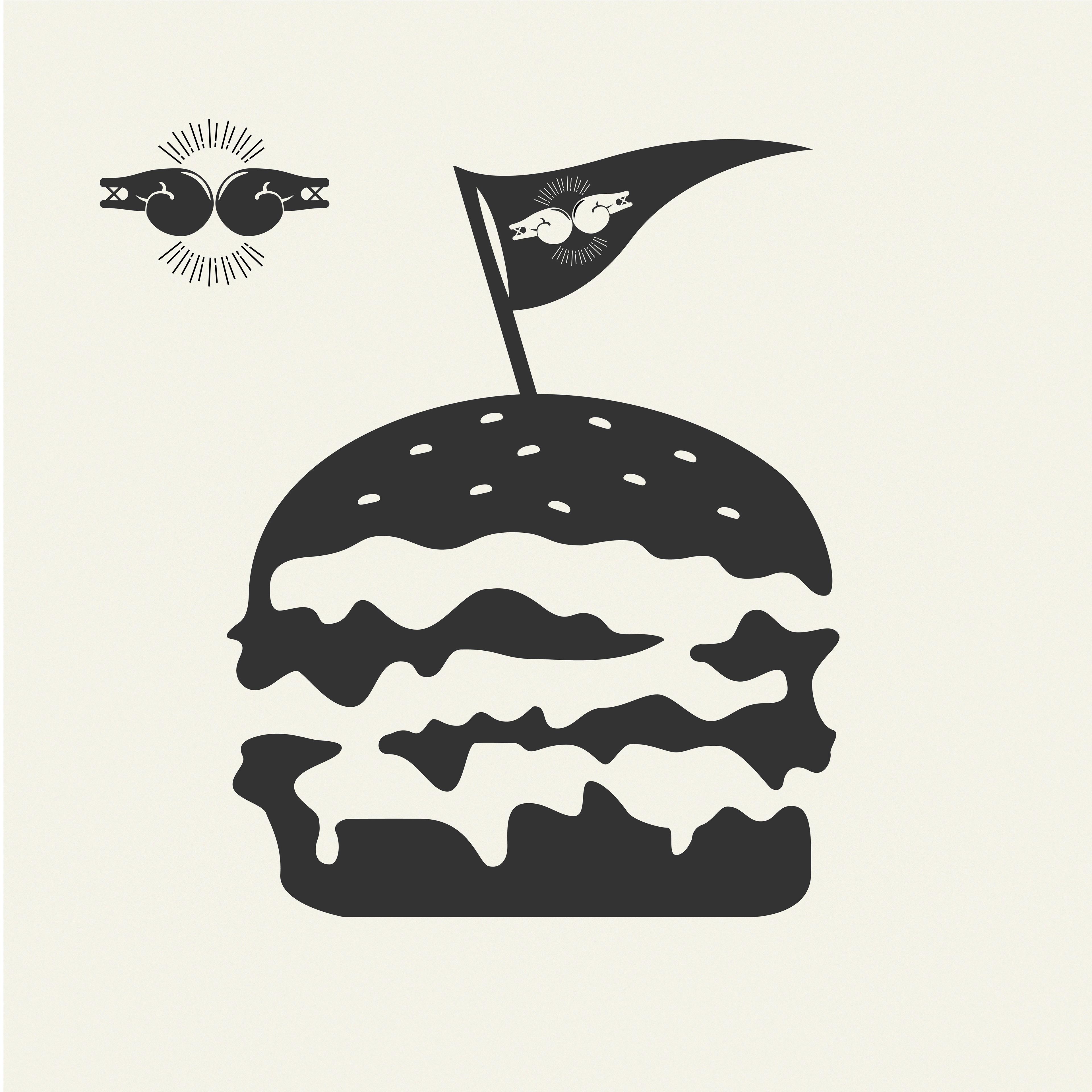
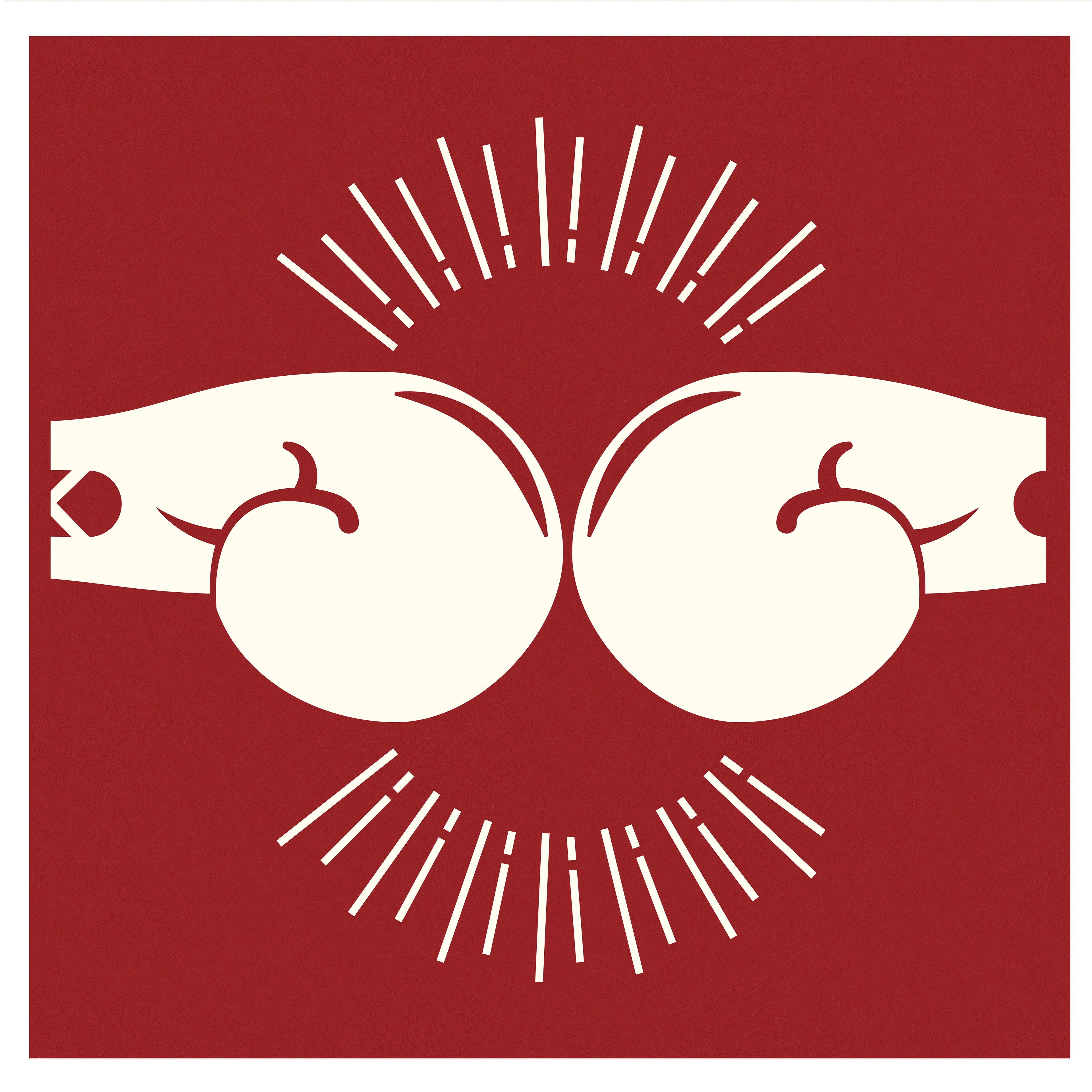
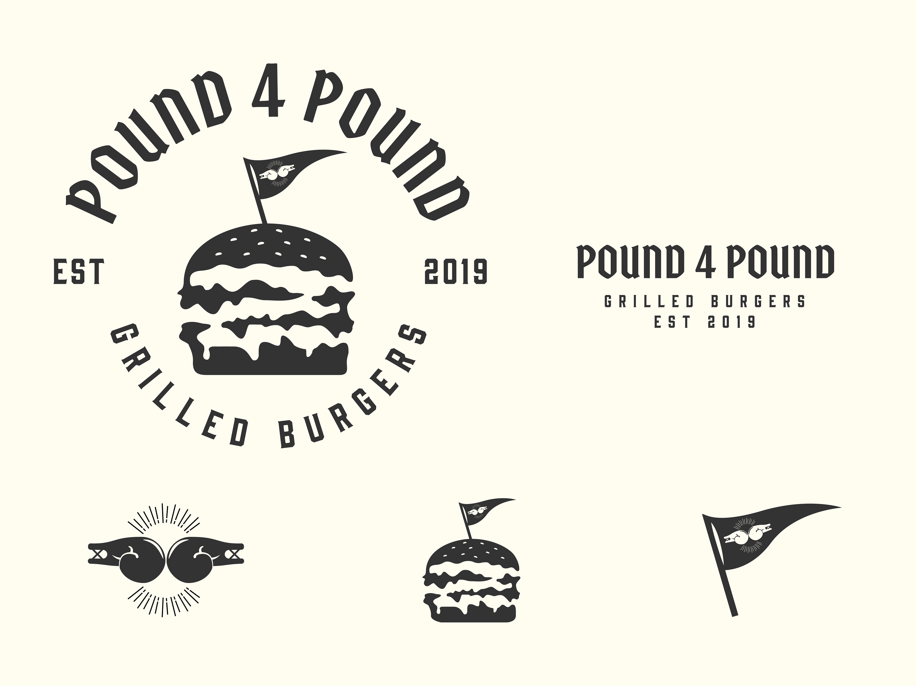
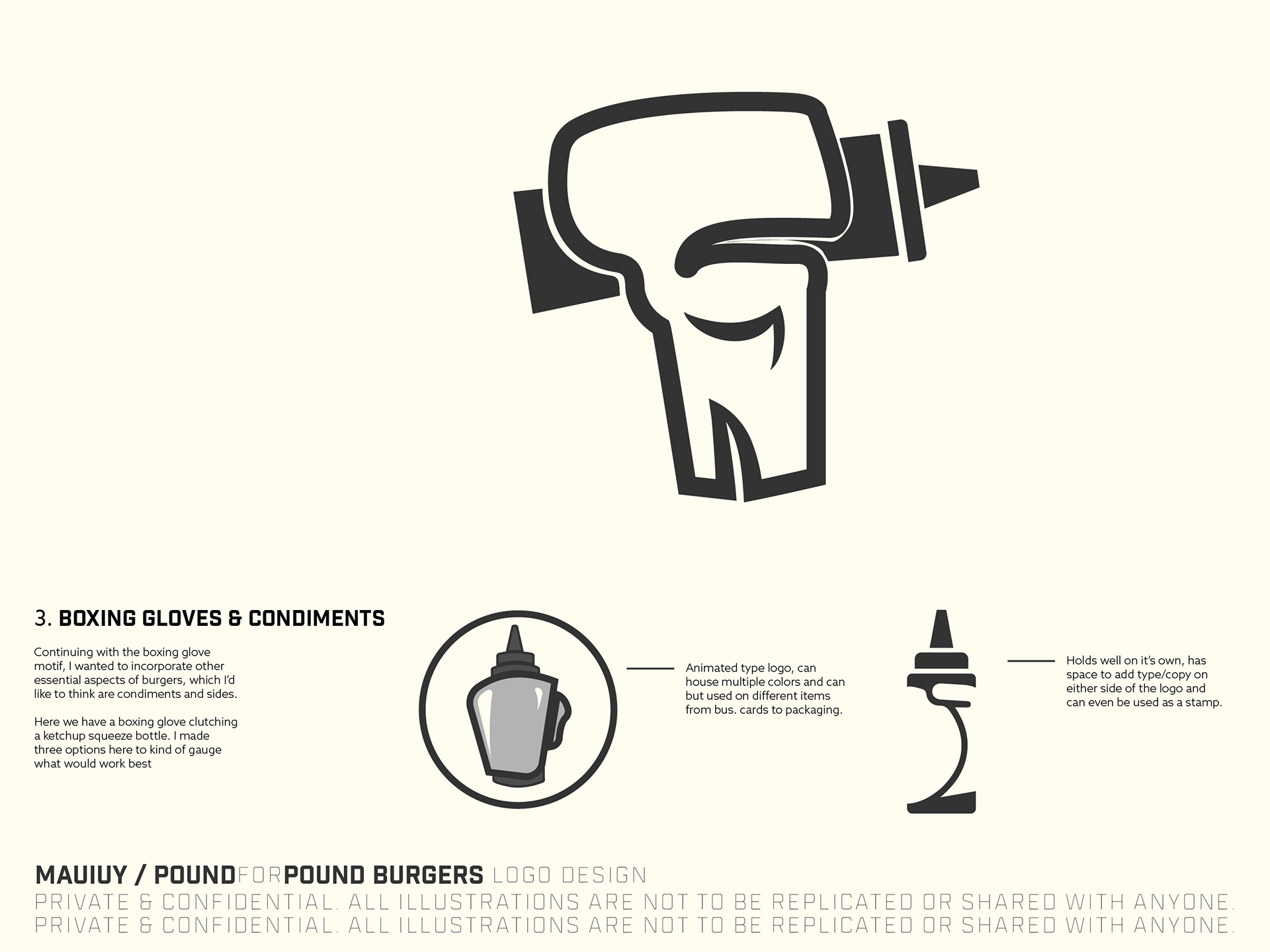
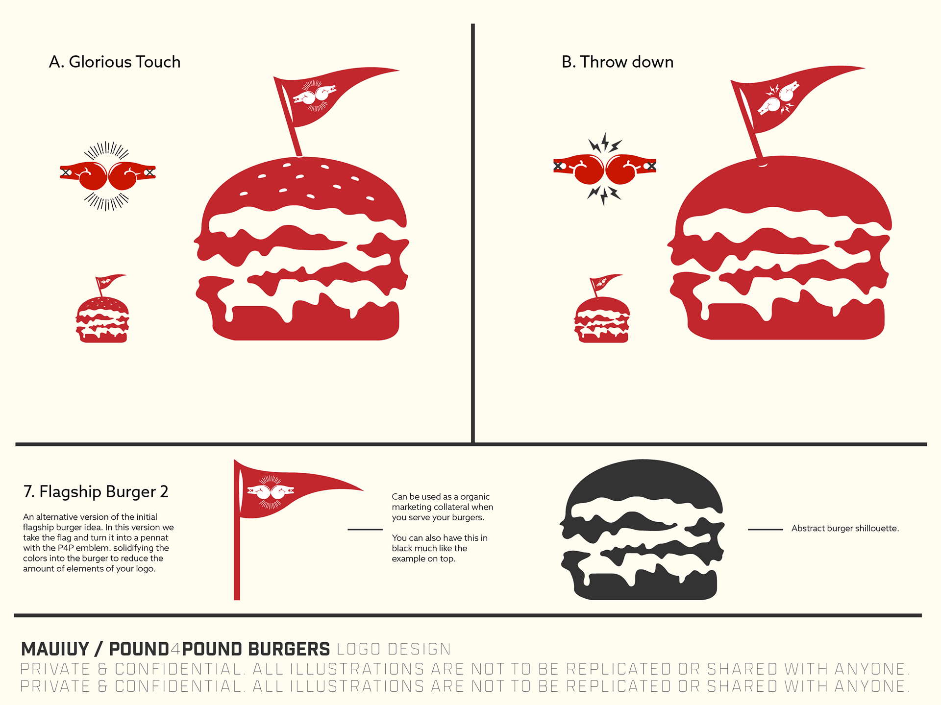
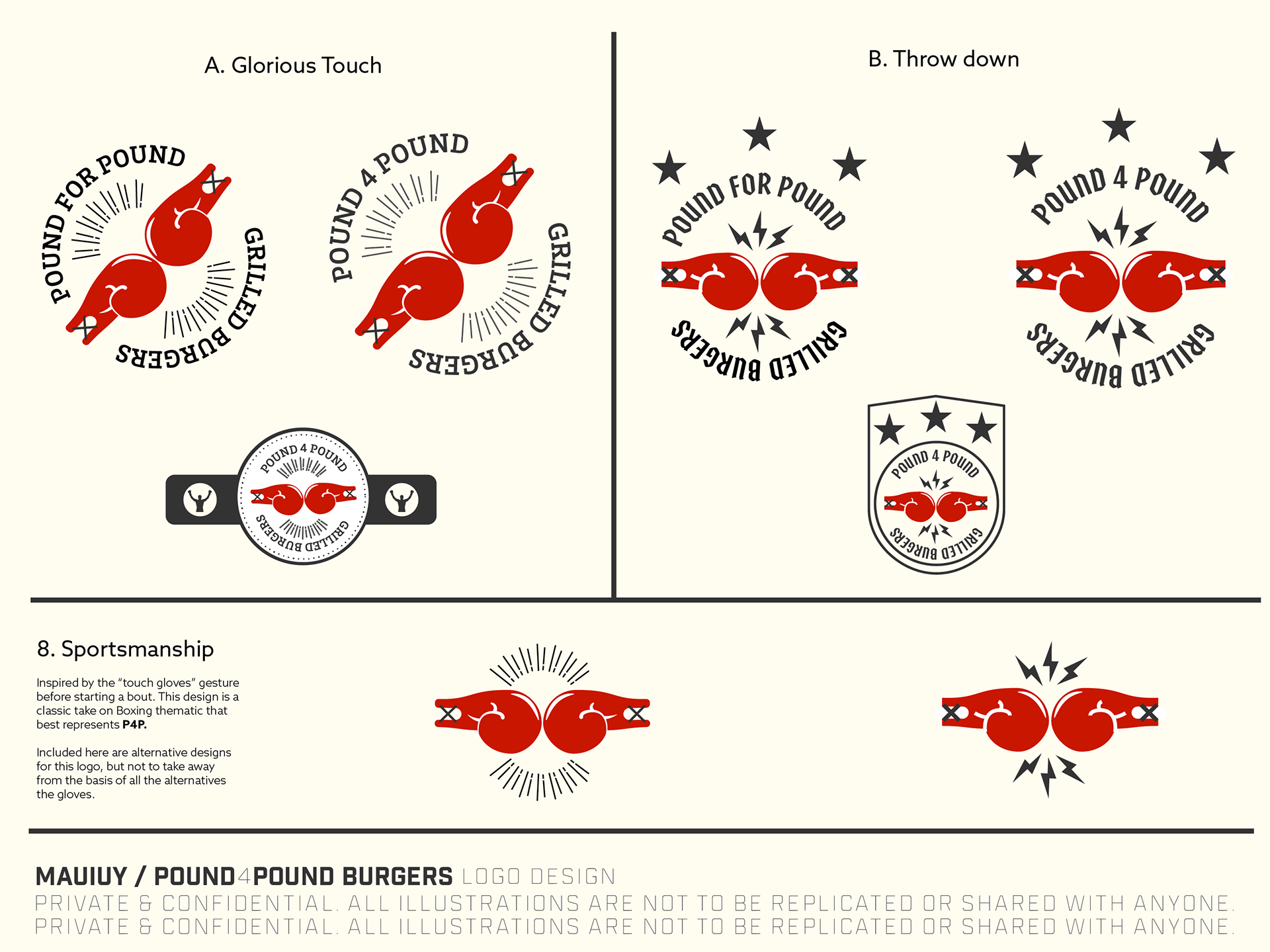
While reviewing round 1's designs, we uncovered a couple of things – one is that the boxing glove was an excellent piece of design that resonated well with our stakeholders. The burger shape was the ideal option because it tied back to what Pound4Pound was, and the drooping cheese motif was a good design choice because it represented how the burgers looked when served.
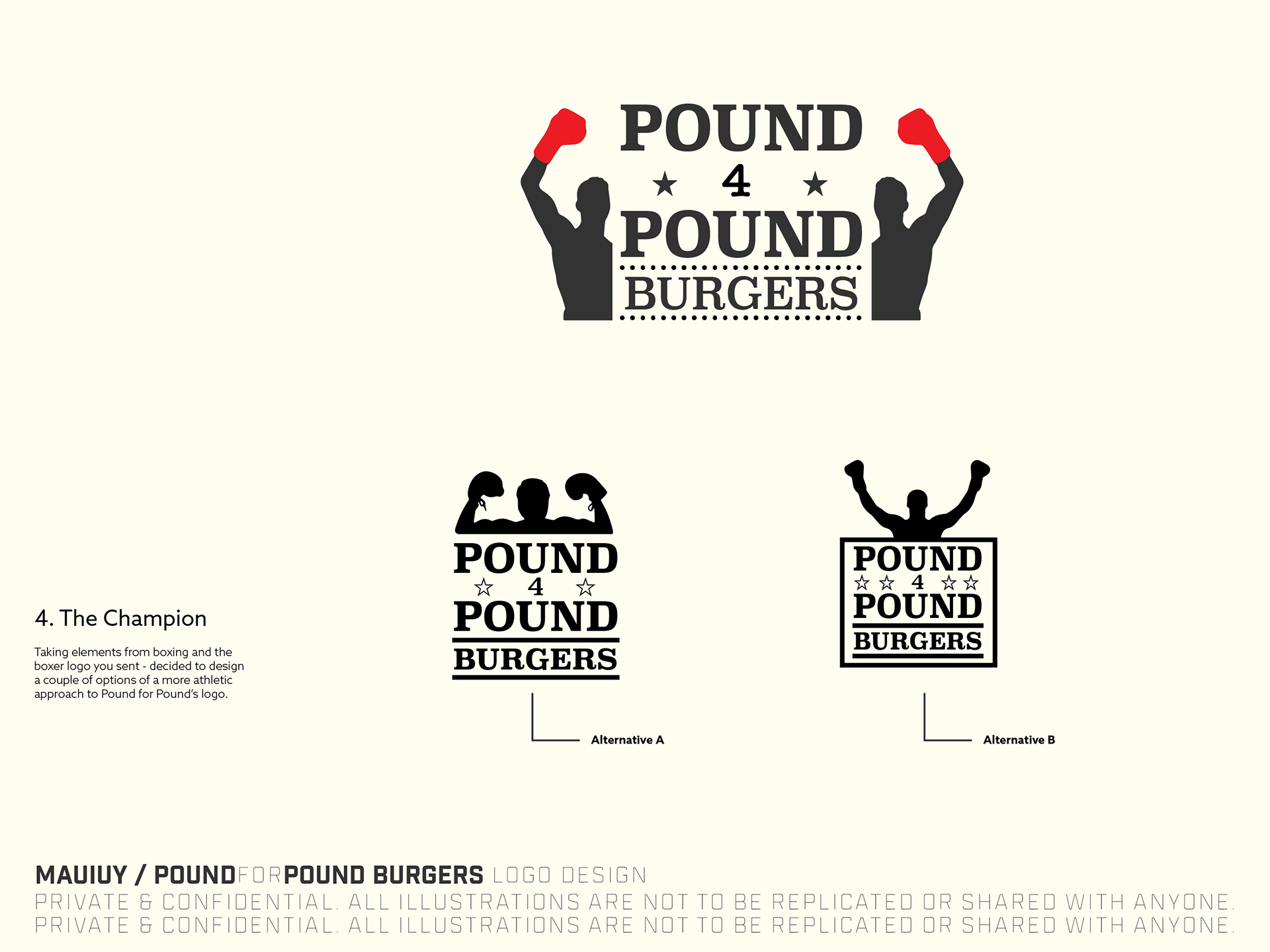
A couple of other takeaways on the initial design round were they weren't very athletic looking, or instead, they didn't bring that championship look and feel that Pound4Pound wanted to establish with their name. Also that the name was "Pound4Pound" and not "PoundforPound" – however, we did try to move to use the word "for" and "four," but eventually, we decided to stick with "4".
A little advice: always make sure you're getting the name right. It accounts for a ton when designing the logo. Keeping in mind how the spacing between letters and words will change in composition, the number of characters will be a factor in deciding how to stack or line up your work.
*ding**ding**ding* Round 3
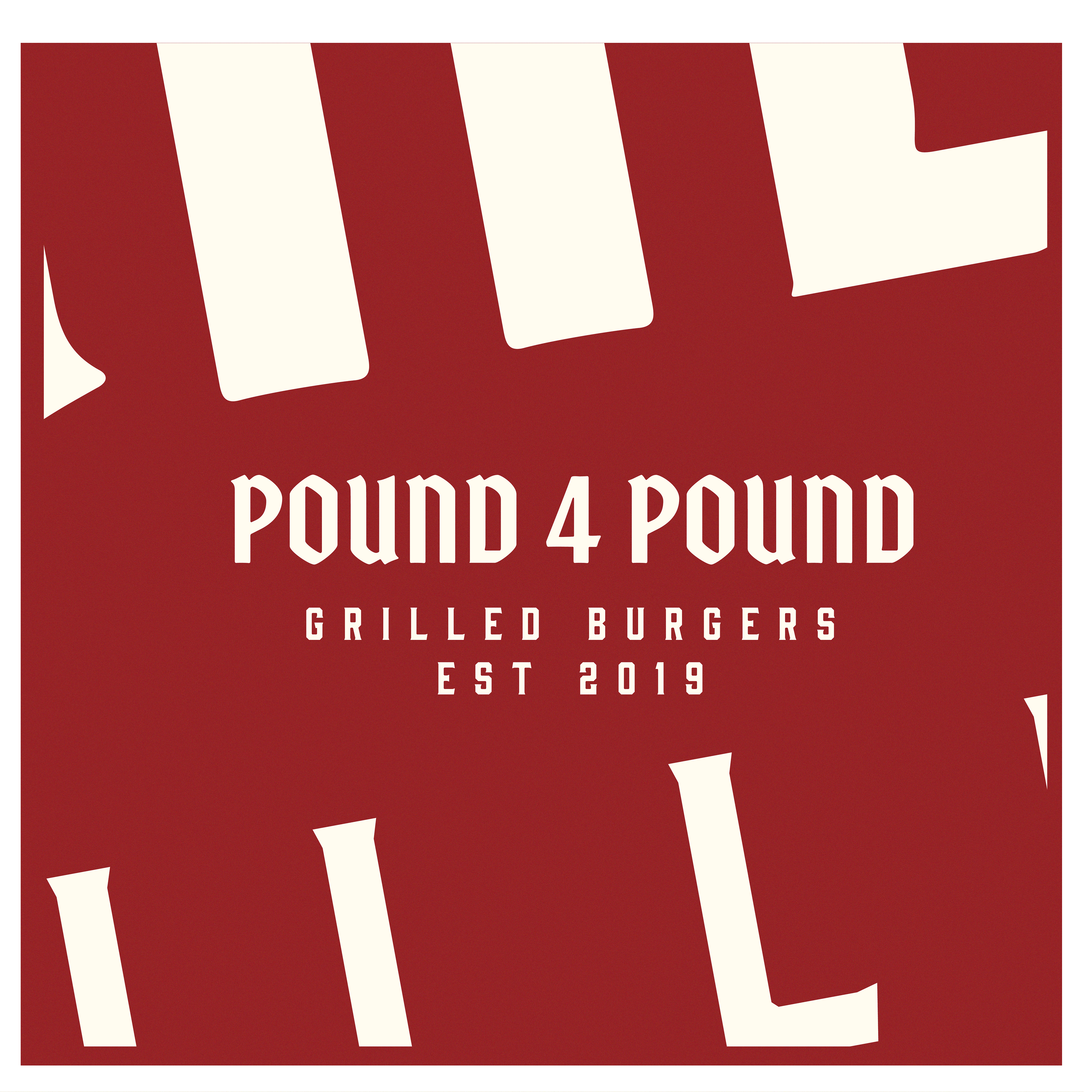
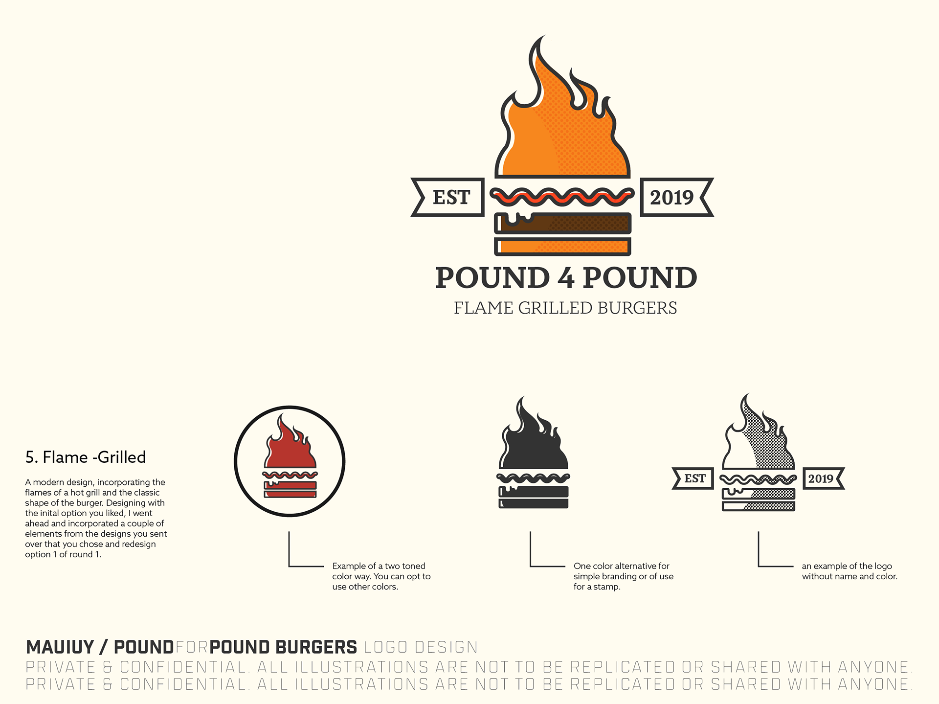
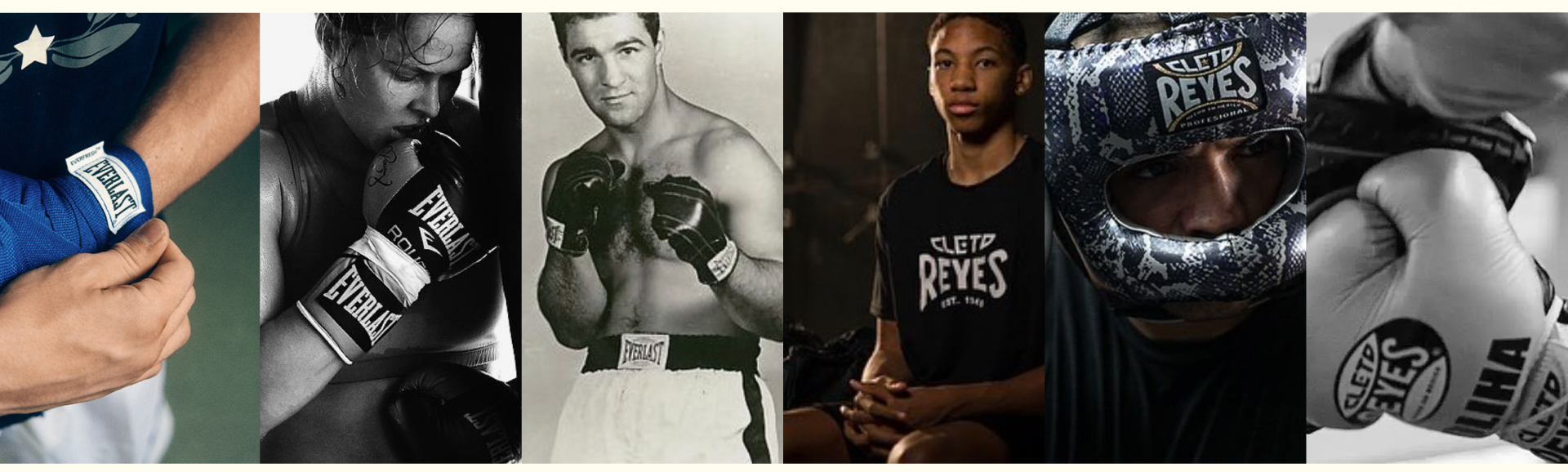
In round 2, we explored the use of serif typefaces and heavy-weighted fonts and introduced a bit of color to the choices. I picked a few references to establish better the brand's athletic background, such as Cleto Reyes and Everlast. The notable design choices of these brands were the use of straight-to-the-point designs and boxy shapes.
The take-aways from the prior round was, we got closer to the athletic design choices but we also moved a little further away from the burger aspect of the design. The use of the color red was something that really appealed to Pound4Pound, as they wanted to use that motif for 2 reasons, one was that color theory defines red as an attractive color and it's notable in a ton of popular restaurants, and second, it resonated with the classic look of boxing gloves.
In the conversation of round 2, we took a deeper dive into the tastes and styles of Pound4Pound. We took some time to determine what direction resonated best with the brand. We uncovered that the owner, Claude Hizon, was not just an avid boxer but also a Motorcycle enthusiast - he took frequent trips out on the road with his bike. We also talked about how he particularly likes setting up shop in breweries, and how he enjoyed the culture that manifested around drinking beer.
Which immediately made me gravitate towards the blackletter style seen in motorsports and breweries.
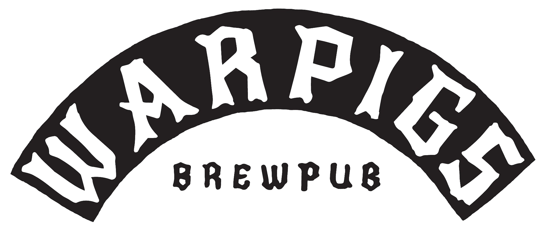
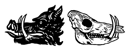
Notably, War Pigs Brewing -I took a couple of ideas from using bold blackletter typeface and edgy shapes to design for our third round of iterations. I just fell in love with the typeface and used the motif of black and white to create the next round.
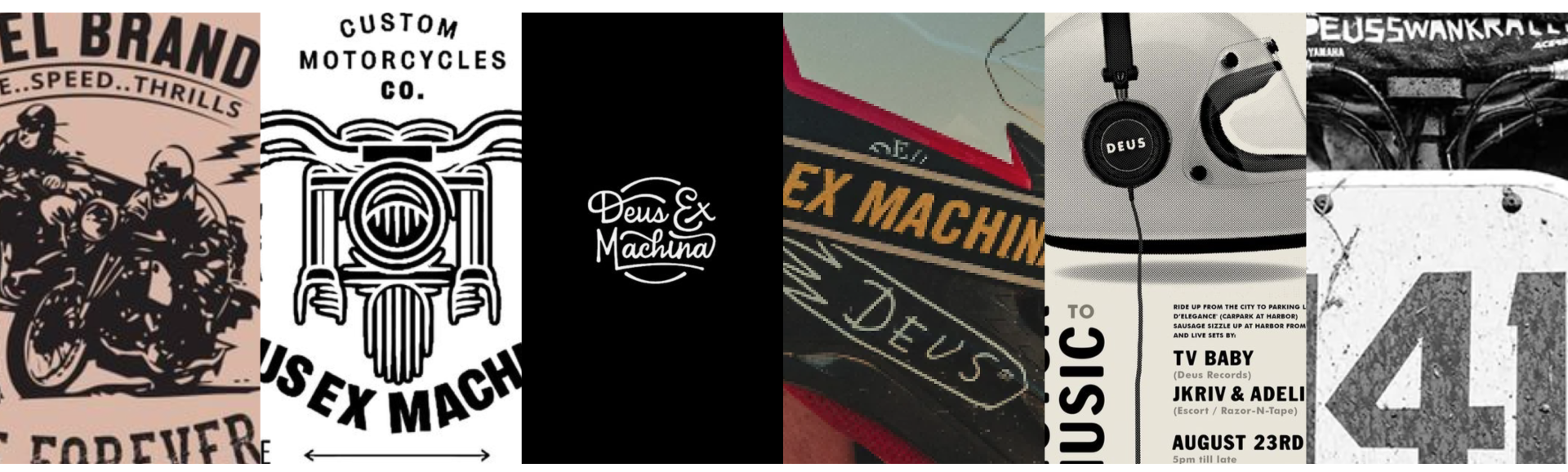
Another reference I used was the art styles seen on Deus Ex Machina, the varying contrast seen on their illustrations and bikes was something I wanted to reference. It had a rustic and grunge look that worked well with the Pound4Pound brand.
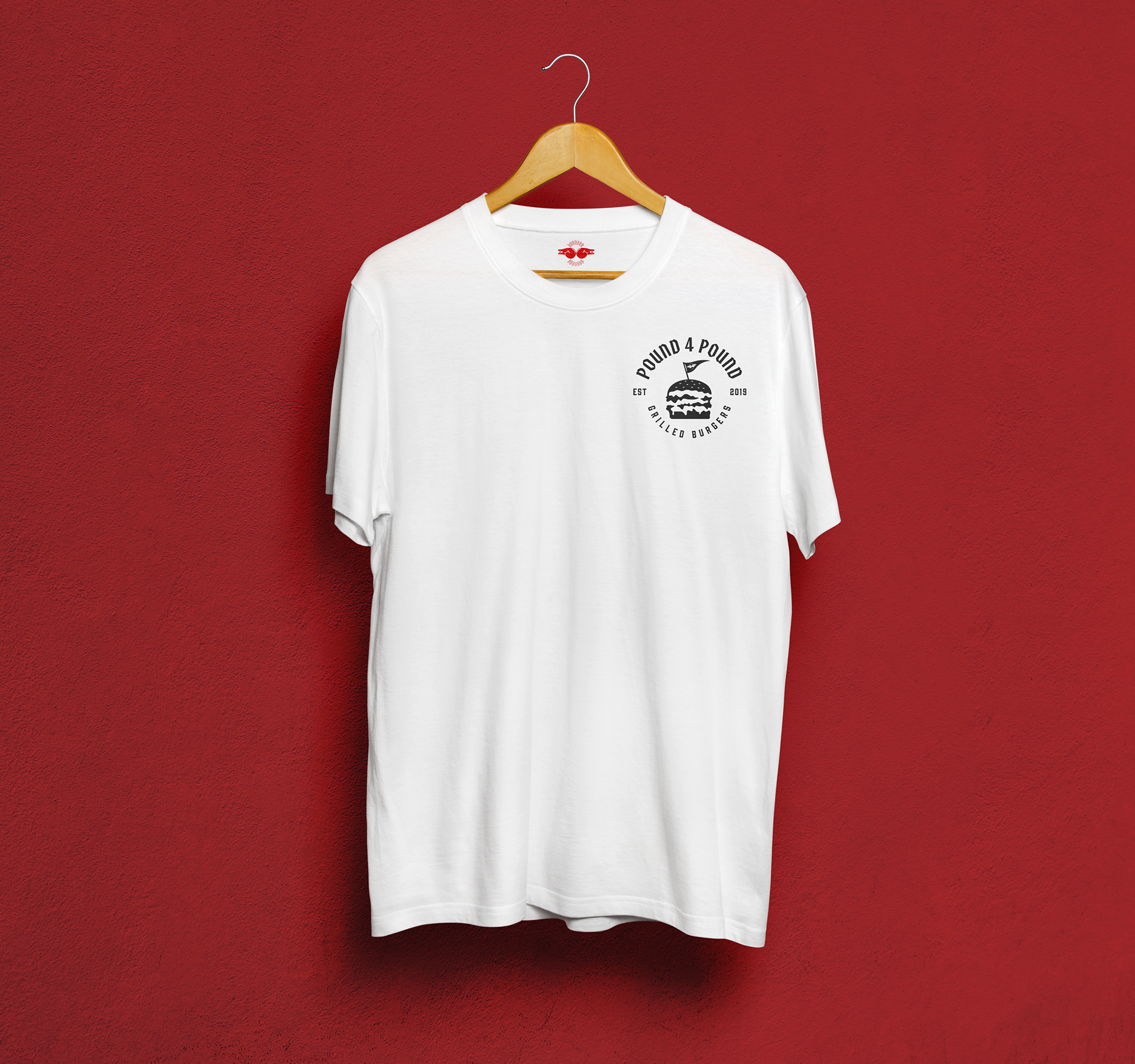
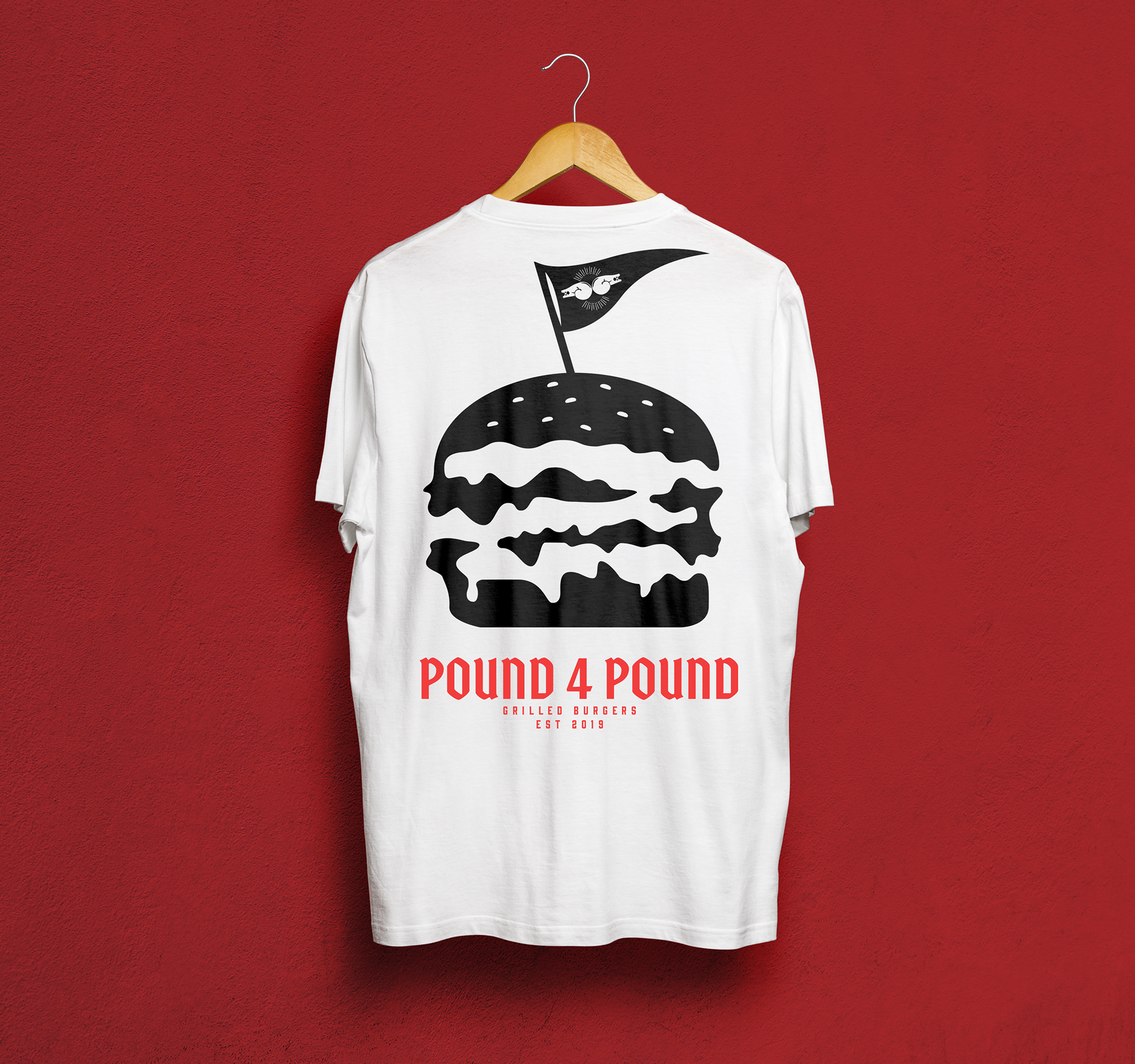
And here are the final results: